A lot of things matter to the player’s enjoyment of a long RPG: game balance, plot and characters, visuals and sound. But although a great deal of attention is given to all these things in the original game, a seemingly small thing is often overlooked during the localization process: the font.
You’ll see it on every screen of the game, more often than you will any other visual element, so over the course of a 30-or 40- hour game, it has a lot of burden to carry. In previous Etrian games, we experimented with designing our own font for the first game (to, ahem, mixed results) and then settled on a built- in system font for Etrian Odyssey II & III.
One of the many upgrades the Nintendo 3DS provides for is the ability to easily implement any standard PC font, and we took the opportunity to venture beyond the default again.
We knew we wanted to go with a serif font for Etrian Odyssey IV, to complement the game’s narration-heavy feel of reading an epic saga. From there, we browsed online font repositories and picked out a few likely-seeming candidates, then made a few crude image hacks to see how they might look when implemented in the game. Our choice had to be legible without being too basic, with the right spacing and kerning to look natural inside the existing boxes, while also being thin enough to accommodate the character limits we’d used during the editing process.
Thyssen certainly met the last criteria with flying colors, but was maybe a little too thin and might have induced eyestrain. Juste was more readable, but left a little too much space between words and lines and didn’t feel substantial enough. Imperator was better in that regard yet too cramped; we doubted three lines could fit without crashing ascenders/descenders.
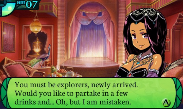
But Neuton, like Goldilocks’ porridge, was just right. Everyone involved in the font review process liked it, and to be sure, we made a few more mockup screens. These served the dual purpose of testing whether it could work in differently-sized text boxes as well as acting as samples for the developer to follow when implementing the font. As you can see from these screenshots, they did a beautiful job of integrating it.