Or you can stick with the brotrip

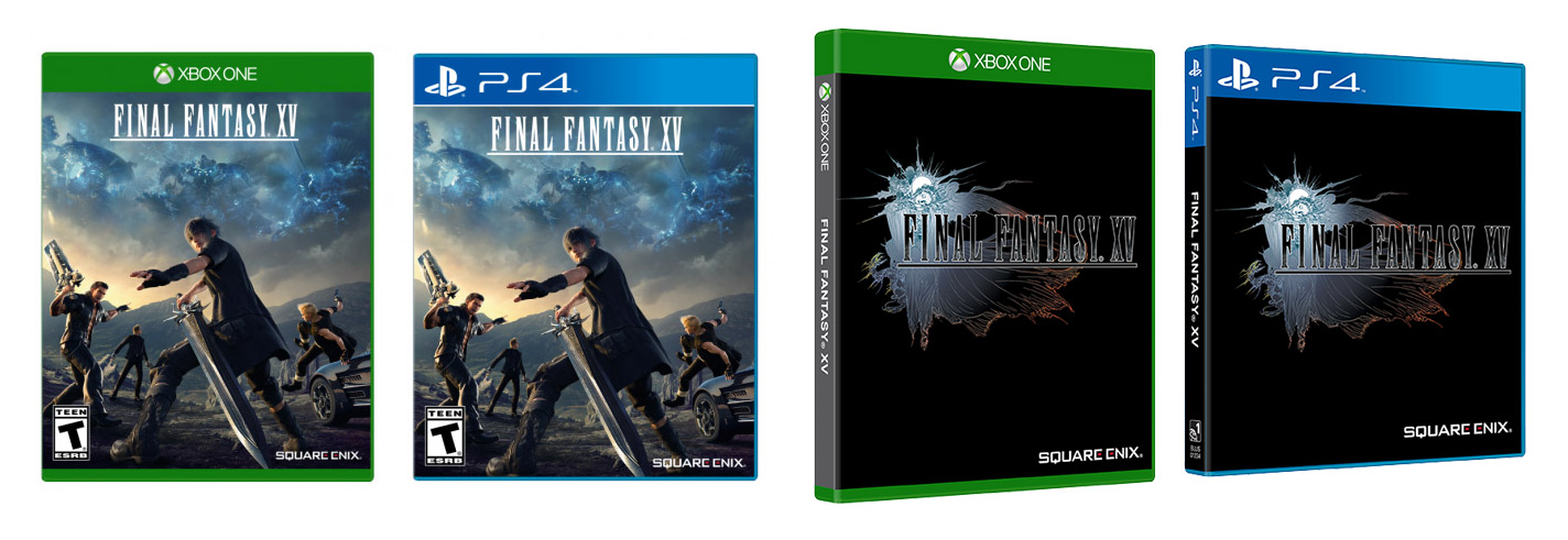
Fancy-pants collector’s editions aside, this is what the box art for Final Fantasy XV looks like in North America and Europe. It’s a slight variation on what was shown back around E3, and for those of you who prefer the classic logo look, that’s also an option. Here’s the reversible cover:

Some folks are mad that the background is black instead of white in keeping with the rest of their series collection. Which, I get it — that’s a mildly annoying part of owning media. My movie and game shelf has more than a few oddly-colored outliers, and I try not to think about it. (Especially the horrible Simpsons season seven packaging that looks like Marge’s head. Just the worst.)
Square Enix also has a blog post that gets into the thought process behind the standard cover design. Those shadowy figures in the sky? “While I don’t want to spoil who or what they are, just know that they are extremely important to both Kingsglaive: Final Fantasy XV and Final Fantasy XV.”
Final Fantasy XV [Twitter]


