From Okami to uggos
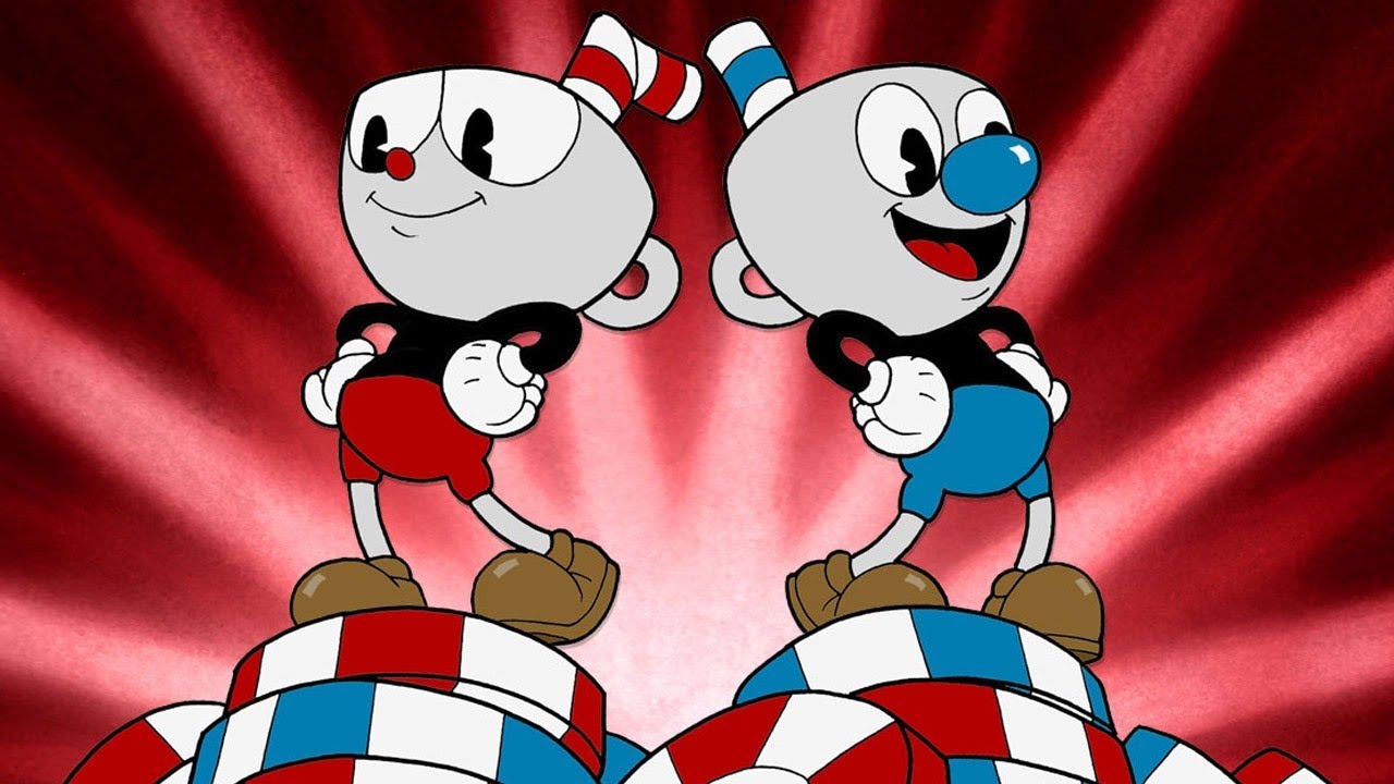
In my circle of friends, I can’t stop singing the praises of Cuphead. Asides from its rewarding challenge of overcoming some splendidly designed boss encounters, its distinct 1930s cartoon aesthetic is unique and hard to compare to anything else right now. Everything feels so authentic, from the film grain effect, the rubber hose motions on everyone’s animation, and the absolutely incredible music. My favorite part is the announcer hyping you up before a fight in a way that’s reminiscent of Capcom vs. SNK 2.
You know what’s a terrible design direction? Marvel vs. Capcom Infinite. At this point it’s just beating a dead horse but should still be said that the gameplay of MvCI is great! It just looks horrible in almost every respect. Just when I get over the visual design and begin to enjoy pulling combos and doing crazy tag combos, the win screen slaps me across the face with some chunky faces.

I thought the juxtaposition of these two games was really interesting to me. One example of a game crafted with the utmost care and love and another with seemingly not much thought at all except in getting its tournament scene up and running. Earlier this week I asked the community when some of their favorite choices in art direction were, from great games with great art to bad games with redeeming qualities, what games would you pick for outstanding art design that isn’t Marvel vs. Capcom Infinite?
For my part, Muramasa: The Demon’s Blade is a personal stand out for me. Really though, anything from Vanillaware is worthy of praise and does indeed get the accolades it deserves.

Formerly Gamemaniac3434 has picks both strong and specific:
Mmmmmmm. I think one of my favorite aesthetics in games is probably Dragon’s Crown – that game just looks gorgeous and in motion it’s pretty beautiful. Rayman Origins and legends also look great – they’re well drawn and the amusingly exaggerated way things happen really helps solidify that tone.
Fallout 3 is an uglier game in terms of graphics but I love the ’50s aesthetic and how it permeates everything-its a strong theme and its one of the reasons I love the game so much, with the music helping to shore that up. And NieR: Automata, while not overly ugly graphically puts its focus on the characters and what matters, and so much of the design there is just lovely.
And Metroid has a great look to it most of the time – its sidescrollers especially have some good visual design.
Micheal Giff chips in the wacky and colorful world of TMNT:
Call it nostalgia because of the SNES craze sweeping the nation but my vote goes to Turtles in Time. That game perfectly captured the spirit and look of the animated series.
It’s also a great look at what a good aesthetic can do for a game. I’m sure I’m not alone as a guy that revisits this game on his SNES on a semi regular basis. How many folks are still playing that disastrously ugly Ubisoft Re-shelled edition? Not as many I wager. So best aesthetic in games? I’m Pizza Power all the way!

Bass points out that SNK has some great backgrounds at work in their fighting games:
In terms of UI, Persona 5 really, really impressed me. Slick transitions between 3D models and artwork, and a very nice sense of style all around.
As for actual in-game visuals, it’s hard to say. I’m still a bit of a sprite art fanboy, so something like King of Fighters has a lot of appeal to me:
Czar Kazem takes an obvious but entirely justified choice:
Persona 5 easily takes it for me, on nearly every level. My adoration for the game is based just as much on its total sense of style as it is on the gameplay and characters. I can’t think of any other game that absolutely oozes cool like P5 does. I mean, you know what you’re in for before the game even starts.

Celica Crazed was not prepared:
Nothing prepared me for the first time I played the Jet Grind Radio demo on the Dreamcast. I had seen screenshots and read previews….and it sounded like it was trying to be too cool for school. But then the demo booted up and holy shit. Holy fucking shit! I hadn’t seen a cel-shaded game before and I couldn’t believe video games could be…that! So bright and colourful, filled with life and neat little effects, tied with that amazing soundtrack. Definitely helped draw me into becoming more of a gamer than I already was at the time.
I think Fuzunga is the first person I’ve heard in a long time to actually mention his choice:
No game has ever looked more unique or beautiful than El Shaddai. Sometimes I wonder if any other game will ever reach that level.
GreenHornet214’s choice reminds me that his choice is pretty clean cut and vibrant:
I really like the voxely look of games like Crossy Road. It’s just pleasing to look at.
Cody Orvik doesn’t really like Cuphead but has other ideas:
Cuphead actually has one of my least favorite aesthetics, it’s just too weird for me. I like Dead Space, most Zelda worlds (Wind Waker, Ocarina of Time, Link to the Past), Super Mario World, and of course the Donkey Kong series.

LuckRequired has a clean choice:
Wind Waker. It’s simple, clean and it works. I love it when games stand out from the pack. Shout out to MGS1, those dirty, blurry textures gave the PS1 classic a gritty realism I wasn’t ready for back then.
Cockaroach reminds me how much I miss Metal Gear Rising:
It’s the age old debate of art direction versus graphical fidelity. I don’t have one favorite aesthetic of particular video games. I loved Katamari Damacy as much as Dark Souls in terms of their aesthetics, and both used their art direction to full effect of their respective worlds and gameplay, and made them better games because of it. I used to love the WoW aesthetic, but I grew out of it. Still, it works for the game very well. When it comes to 3D games, I do love high fidelity fantasy, like Dark Souls, or Metal Gear Rising. MGR’s aesthetic is slick as hell sci-fi mixed with industrial and urban settings. The characters are stylistically designed, from Monsoon to Sen. Armstrong, to Jet Stream Sam. They work well with each other and fit in the world nicely, and made them bigger than life when their powers are revealed.
Sonic429 has the stand out choice for shooters:
People tend to forget that Borderlands was never originally made with the cell shaded art style, that was done very late in development. While it’s by no means my favorite shooter, I can’t help but love the Borderlands art style. In a day and age where it’s becoming difficult to tell shooters apart, Borderlands stands out.
Obviously everyone has a choice for strong games. So what about you? Here’s one last swing at the dead horse, for the road, courtesy of one channel I watch. Really this picture is a great point of comparison for why the jokes may never stop about MvCI.


