There’s something special about Lucidity’s style. A combination of paper textures and brilliant colors, the visuals of the upcoming Xbox LIVE Arcade and PC title pops and stimulates. In a recent e-mail interview with Destructoid, project lead David Nottingham revealed the influencers of the art direction, as well as pegged a few reasons as to why LucasArts decided to go with the unique look.
“One of the attractions of working on smaller games, is the level of creative freedom it affords you, to experiment and take risks that you might otherwise not be able to on a big budget game,” Nottingham told Destructoid.
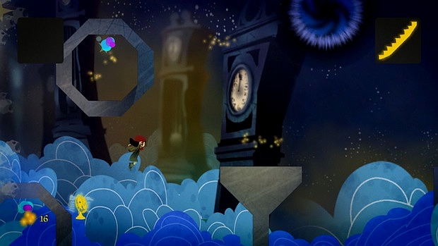
“For Lucidity, we wanted to develop a unique art style that didn’t really feel like anything else and it was developed hand in hand with the story, so that one would complement the other. Jeff Sangalli (the art director) and I are both big believers in visual stylization and he was talking about wanting the game to feel like a pop-up book, using multi-planing and 2D cards to help achieve the affect,” he said.
A combination of LucasArts artists helped create the experimental look. A look that blends 2D and 3D — something Sengali wanted to do with The Secret of Monkey Island: Special Edition but couldn’t because of the original sprite animations.
Hit the break to learn more about what several of these artists brought to the project in the visuals category.
“The style was largely developed working with Andrea Rhodes,” Nottingham told us. “If you look at her work, you can see a Mary Blair influence but she’s pretty unique. This was kind of a dream project for her as it fit her distinctive art style so perfectly.”
“I should also mention Molly Denmark, who created the look of many of the in-game worlds and did an amazing job. All the backgrounds and game geometry are digitally hand painted by her, Jeff and Dela Longfish, essentially the same art team that created all the background art for Monkey Island: SE,” he said.
“Something else that was cool was the paper texture that was applied to the artwork. There’s kind of a style you see in children’s books where the artwork can look like cut paper. You see this in books like The Hungry Caterpillar by Eric Carle.”
“The concept of combining 2D and 3D was Jeff’s. He’s been big on that for a while and had wanted to incorporate it into Monkey but was unable to due to the limitations of having to overlay over the original sprite animations. The team finally got to embrace it on Lucidity and its one of the aspects I’m most proud of. The animation work from Jeff Brown and Saul Ruiz was fantastic and the team did a great job integrating the 3D and 2D so it all fit together. The textures for all the 3D models were also all digitally hand painted so they would fit in with the environments.”
“I’d love to give shout outs to all the artists here as they all did such a great job but suffice to say, I feel very fortunate to be able to work with such a talented group!”
Indeed he should. Often I find myself unimpressed by visuals. Monkey Island: SE was a bit of a special case for me because of my longing for something proper to be done with the franchise. But Lucidity has a fascinating style, nearly as compelling as it’s Lemming’s-style gameplay. Look for more from Nottingham on Lucidity in the near future.


