You caught that new Sonic teaser, right? For Sega, another year means another potentially misguided attempt at bringing the blue blur “back to his roots.” ‘Round the Sonic Cycle we go, once again!
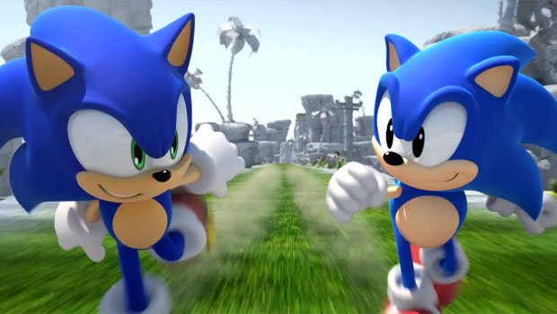
This latest nostalgia grab finds the Sonic of the present meeting his Genesis incarnation, pot-belly and all. For years, we’ve had to deal with outraged fans who would not shut up about how the modern Sonic design is sooooo stupid and the classic one was a billion times better. If only Sega would give him back his old look, then all the problems with the franchise would be solved!
Sega probably tossed in the throwback look as a kind gesture to long-time players, but I think it’s only going to fan the flames of dissension even harder. Already in some circles, the complaints have begun anew. But before I explain how foolish this whole non-issue is, I ought to share my personal preference.
I really like Sonic’s modern design and prefer it over the classic one. There’s nothing wrong with it at all.

Kids these days certainly don’t mind as they have nothing else to compare against, but I guess it’s an unpopular opinion amongst the over-20 crowd. It’s not that I dislike the original style, no! I just find that the newer style suits the character better.
It’s one thing to have a preference for the older look; it’s something else entirely to be seething with bitterness as though the “green-eyed beast” was solely responsible for murdering the brand. To this day, I’ve yet to hear one solid reason as to why the current look is objectively inferior.
The current design was introduced back in 1998 with the release of Sonic Adventure. Minus a few subtle nips and tucks here and there, Sonic has held this same look for nearly 13 years, a greater length of time than the seven years spent as Mr. Chubby Buddy. You’d think people would have gotten over this nonsense by now, but nope! Still bitchin’!
The only reason I can fathom for such disdain is that fans are unable to divorce the quality of the character design from the quality of the games. Maybe I was running with a more open-minded crew, but back when the Dreamcast launched, I never once heard someone complain about how goofy Sonic looked. All I heard was, “Oh my God! It looks so real! Look how fast Sonic runs! This is awesome!”
After the 3D honeymoon was over (right around the time that the Dreamcast was retired, coincidentally), the Sonic games began to lose critical favor, and fans began picking apart what they saw as flaws in Sonic’s design. It’s not a stretch to say that players associate the modern look with unsatisfactory experiences and the classic look with golden memories. It’s a Pavlovian response — you see those eyes and a cold chill runs up your spine.

It is possible to weigh the parts of a whole independently. For example, I’ve never watched My Little Pony because I neither was nor ever will be an eight-year-old girl. However, I’m not ashamed to admit that I find the new show’s art style very appealing. It has a very a Craig McCracken vibe to it (sure enough, his wife is the creator). That doesn’t mean I’m gonna start snatching up pony merch or anything!
Sonic’s current look just makes sense. His waistline was trimmed down and his legs were lengthened to give him more of a runner’s build. I mean, have you ever heard of a speedster who wasn’t skinny? In addition, his quills were smoothed out to be more aerodynamic. Then there are the eyes, but seriously… c’mon! No big deal!
Sonic retained his curt attitude and playful disposition, the qualities that we all thought were hip and cool when we fell in love with the character back in the day. The difference now is he looks like he’s in motion even while stationary. He’s the essence of speed rather than a rotund critter who also happens to run really, really fast.
This is the part where someone raises a crooked finger and points out that it makes no difference how sensible any alterations may be if nobody asked for them in the first place. Players love the old Sonic; there was no reason to “fix” him!
Unfortunately, that’s an unrealistic expectation that fails to take into consideration multiple factors. Nearly every single character in comic, animation, or games history who has been around for more than a handful of years has undergone at least one redesign. This happens because of improvement in an artist’s ability, reinterpretation by an artist other than the original, change in cultural decade, reintroduction after an extended hiatus, or desire to revitalize an ailing property.

Character redesigns range from sudden and sweeping to gradual and subtle. Ever read a manga that ran or has been running for five years? Ten? Twenty? The art matures and the characters take on a more definite appearance almost seamlessly, and it’s only when you directly compare older chapters with newer ones that you fully comprehend the changes. Essentially, it’s impossible to prevent any kind of change from occurring.
Funnily enough, I never hear as much whining about other redesigns as I do about Sonic’s. The complaints are louder than even those for legitimate cases. Remember that proposed Klonoa redesign, the one that would have swapped his floppy ears and Pac-Man cap for crazy bat ears? How about the nightmare that was Bomberman: Act Zero? Sonic’s tiny little tweaks are tame in comparison!
Do you want an extreme case of bad character redesigns? A few years ago, Warner Bros. Animation tried to update the Looney Tunes to appeal to the modern youth raised on high-octane anime like Dragon Ball Z and Naruto. The familiar Looney Tunes cast was re-envisioned as martial arts superheroes living in the distant future. The result was Loonatics Unleashed, and it was far worse than you could possibly imagine.

There was so much wrong with this show that the character designs were the least of its problems, and the designs were bad! Look at those fuckers! They look like they escaped from a box of Prismacolor markers! The sad thing is that these were the improved revisions! The original designs had to be revised because they were too frightening!
Someone on another site actually said that the old Sonic style was cute and timeless like Mickey Mouse. First, let’s try to remember that Sonic was originally conceived and marketed specifically as an edgy alternative to Mario. On Saturday mornings, when I was watching Sonic lead a rag-tag resistance on a cold and grimy totalitarian world, descriptors like “cute” and “adorable” couldn’t have been further from my mind. I can’t remember a single child during the 90s who thought Sonic was “cute.”
Second, Sonic is a timeless icon like Mickey Mouse? Alright… which one? Be specific! Is it the black-and-white Mickey from Steamboat Willie? What about early Technicolor Mickey from Brave Little Tailor? Or the “Hey! I’ve got eyeballs now!” Mickey from The Sorcerer’s Apprentice? Or the “I could stand to get a little bit of sunlight” Mickey from Runaway Brain?
The evolution of Mickey Mouse is fascinating in that so many drastic alterations have been made, yet he remains instantly recognizable in any form. All you gotta see are those two big ears and you just know. If the vague outline of Mickey’s head is all it takes to acknowledge an old friend, clearly a character who has undergone fewer, less outrageous changes would be even easier for new, long-standing, or lapsed fans to recognize, right?
Of course, you can’t discuss Sonic without drawing comparisons to Mario, as I’ve already done a few paragraphs up. It’s time to stick a fork in this roast and examine the man who reinvents himself more times than Madonna.

It’s pretty amazing to note that Mario’s look was constantly tooled around with for nearly a full decade. Hell, he didn’t even have a proper name in his gaming debut! He was Jumpman, a carpenter in red overalls who looked more like Popeye than the boyish icon we’re familiar with. Then when Mario Bros. landed, we were greeted by a very Osamu Tezuka-ish man who for some curious reason chose to invert his blue-red color combo.
By Super Mario Bros. in 1985, Mario’s appearance began to take definite shape. His irises became light blue, and he strapped the red suspenders back on. Three years later, he swapped his color scheme for the last time while retaining his red cap. Since then, Mario has seen a few incremental updates, including a height boost not unlike Sonic’s, but nothing to the same degree as what came prior.
However, that’s not the end of Mario’s wardrobe adventures. He’s a true Renaissance man, crossing into other genres, constantly exploring and experimenting. Often, his excursions are accompanied by a radically different look.

The most outrageous of the one-off designs, in my opinion, has got to be his Mario Strikers garb. Talk about “X-treme”! I kinda dig it, though. It’s very dynamic, and it did the rough outline look long before Street Fighter IV. Yet despite its aggressiveness, it’s still all Mario.
The core essence of Mario’s character always bleeds through his various guises. I suppose it doesn’t hurt that his titles are regularly of the highest caliber — being the best in class means that the public is more willing to accept some fresh digs now and then. Or perhaps it is precisely because Mario is such a random variable that players have almost come to expect regular reinterpretations.
When you see all these other characters reforged with so little, if any, negative feedback, how is it that Sonic the Hedgehog takes so much abuse? What if Sonic were to be redesigned again in the near future? I can guarantee it wouldn’t be a return to the old style for the sake of satisfying a vocal minority. Would that be another rough blow to the fandom?
For those of you bursting with green-eyes Sonic hate, I ask you to cool down and reflect upon what you’re really upset about. For the rest of you, I hope I’ve been able to offer a little perspective on the nature of change.
Everything’s gonna be alright, guys!


