[Keep writing your Digital Distribution blogs for this week’s Bloggers Wanted topic — you can still write them all the way up until the new topic is posted next Monday. Today’s promotion from last week’s topic on freedom is from nekobun, who brings us a unique perspective on the idea of freedom and talks about the downsides and constraints of overly-busy heads up displays. Want to see your own blog on the front page? Write a blog about Digital Distribution, and it just might get promoted next week! — JRo]
Games these days have an awful lot going on at any given point. Considering I’ve lived through about five console generations, it wouldn’t surprise me if anyone said I was old fashioned for saying it’s often too much. You’ve got life bars, shield bars, ammo counts, minimaps, objective points, support item loadouts, spell lists… it just goes on and on, and clutters up the screen on top of everything that’s going on around or in front of you (depending on whether you’re playing third or first person, of course). Efforts are sometimes made to simplify things or scale them down so they’re out of the way, but that just makes them less sensible and harder to interpret, even moreso for the poor bastards with digital copies, rentals, or other versions of the game that lack a manual.
I miss the days where games were more clean-cut in their presentation, and had a lot less to keep track of at any given time, or at least kept those sorts of currently-considered essentials in a supplemental menu. I miss the simplicity of knowing three hits would kill me, and having to remember landmarks or drawing my own mini-maps to make sure I was going the right way in the new worlds presented to me on a regular basis.

Sure, you could argue that with the advances made since the days of eight-bit and even earlier, games have gotten so involved and expansive that we need all these tools right in our face to even hope to navigate them. HUDs keep us on task and un-confused, and without them, we’d be lost in games for a great many more hours than we’d really like to or need to be. And, in some cases, HUDs actually fit the context of the games they’re presented in; the Halo series, for instance, lays everything out on what’s presumed to be a digitally projected display inside John-117’s, the rookie’s, or Noble Six’s helmet, which makes perfect sense for the powered armor of a SPARTAN-II, ODST, SPARTAN-III, or any number of SPESS MEHREENS from other, similarly sci-fi’d-out games. Same goes for flight sims, especially the futuristic sort, as these kinds of layouts are things that do or could concievably exist in their respective worlds.
It’s when I’m driving through a city, a la GTA, and there’s a handy map down in the corner with a bajillion different colored points on it trying to show me where I can find my next story objective, the nearest spray shop, several burger joints, a fistful of side quests, one or two safe houses, and the whereabouts of someone out to kill me, all at once, that this sort of helping hand begins to start feeling like more of a hindrance. Not only does excess HUDdery clutter the screen and detract from immersing oneself in a game to any great extent, but it often feels like excess hand-holding, and to be honest, is rarely presented in a way that’s contextually coherent with the game’s feel. If, say, I had to look at a subscreen that looked like a city map (much like overworld and dungeon maps of the games of yore), or needed to punch in a target’s address given to me by a contact into an in-game cell phone’s GPS system, I’d feel a great deal more comfortable and involved in that game’s universe.
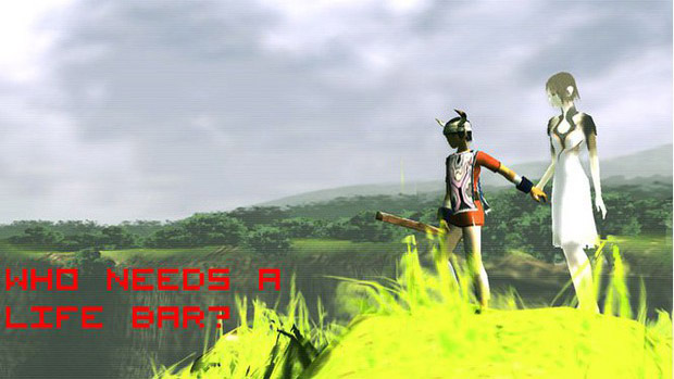
Generation and technical advancement is no excuse, either. Both early on and toward the tail end of the prior console generation, Ico and Shadow Of The Colossus proved that expansive, breathtaking worlds were perfectly navigable, and arguably much more beautiful, with any sorts of heads-up displays stripped away. Beyond the obvious, glowing weak spots on the Colossi in SotC, player direction was much more organic in both these games, with queues coming from the environment, or requiring some exploration and discovery on the player’s behalf rather than merely being handed on a silver, “Go Here,” platter.

If anything, advances in technology, especially on the graphical front, should be opening the door for more minimalist informational displays to make a resurgence. We’ve reached the point where it shouldn’t be that difficult to show just what a character has equipped by having it hang from their belt, off their back, or what have you, even if the actual equipping needs to be done in a menu. Journey, a PS3 title currently in beta, does away with a HUD entirely as well, along with any clear communication aside from some brief control indicators early in the game, leaving all pertinent gameplay information to be portrayed through the character’s appearance on-screen. This sort of approach forces the player to pay a great deal more attention to the game world and the character they’re controlling, lending itself to a far more involved, and likely more memorable, experience on the whole.
Being stuck, as we are, in a day-to-day world where so much is mappable, GPS-able, wiki-able, or otherwise already discovered and explored, it would be nice if game developers could spend more time giving us more new frontiers to explore for ourselves, and spend less time coddling us players as we explore those worlds. Contextual relaying of information would be a great way to make players feel like they’re really part of things that are happening onscreen, and inspire more interest in stories that they subsequently feel they’re impacting, which, I feel, would lead to more impactful and memorable games, something the industry seems to be seeing a fair drought of the past few years, despite a glut of releases every month.

Your 3D televisions, motion controls, and all that rubbish are not the way to make games more immersive. Toss that nonsense, and take your mini-maps, hit points, and other clutter, and throw it out too. Just tell me how many magazines I have, how many shots it takes to empty one, and leave me to do the counting. Let me know how many hits it will take to kill me, and I’ll do my best to avoid that, especially if it’s a very low number. Tell me which princess I need to rescue, scatter about some people/mushrooms/what-have-you for me to ask about how I should go about rescuing her, and let me take it from there. We’re big enough kids, for the most part, that I think we’ll puzzle things out in the end.
Do leave me a reticle, though, if you are going to give me a firearm. I can’t guesstimate where the bullets are going to go besides, “out the end that’s pointed away from me,” to save my life.


