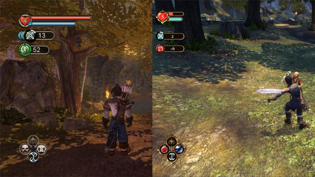
Yup, that’s a HUD, all right.
Progress continues to be made on Fable Anniversary, an HD remake of the original Fable game for Xbox 360 which will bring the entire series to the console. A recent post on Lionhead’s developer blog from User Interface Artist Jenny Peers features comparison shots between the Xbox release and the forthcoming remake to show how menus and the HUD overlay will look and feel.
It’s a huge improvement, to say the least. It’s been quite some time since I hooked up the old Xbox and played Fable, and I had totally forgotten what its menus looked like. They’re kind of hideous and blocky, while the new designs for Anniversary feature more attractive fonts and better organization for the menus. Meanwhile, the HUD has been kept familiar (mostly just gilded and refined), but players will be able to set the opacity of that HUD to their liking. A nice touch.
I can appreciate all the work they’re doing, but it’s not likely to get me to buy Fable again. The trilogy of core games reminds me of a prosciutto, tomato and goat cheese sandwich made with a stale baguette. There’s something really awesome in the middle of it all, surrounded by a fair bit of disappointment. No thanks.
Fable Anniversary UI: Old and New [Lionhead Studios]


