Originally Zelda: Breath of the Wild had a much darker look

I like both!

Recommended Videos

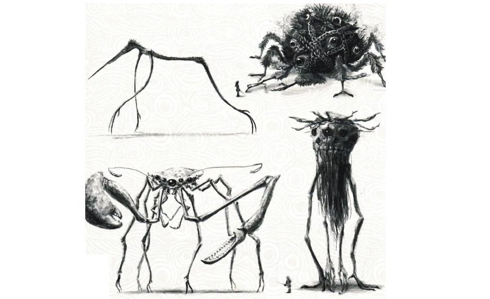
Zelda: Breath of the Wild had a glorious aesthetic to it: bright and vibrant, to the point where even the mechanical aspects of the game felt like they had life. But this concept art from the Master Works 30th Anniversary book are something else entirely, to the point of pure nightmare fuel of Lovecraftian proportions.

Obtained by Gaming Reinvented, the most stunning piece of art showcases the hellish look of the Guardians, but there’s also a ton of other interesting tidbits in there like the interior of Hyrule Castle before the fall, as well as other various facets of the universe and NPCs.

I’m sure a lot of people who are down on Breath of the Wild would have preferred this look, but after really thinking about it — I’m absolutely happy with both. It would be nice to see Nintendo move to a darker tone one day, but they nailed the destruction of Hyrule regardless.

Zelda Breath of the Wild Masterworks Book Reveals Interesting Development Details [Gaming Reinvented]


Destructoid is supported by our audience. When you purchase through links on our site, we may earn a small affiliate commission. Learn more
related content
Read Article Diablo 4 devs talk player feedback, big balance changes, and more in today’s Campfire Chat
Read Article Final Fantasy XIV will share some 7.0 Job details during May’s Live Letter
Collage of Jobs in Final Fantasy XIV
Read Article XDefiant finally gets an official release date
xdefiant
Related Content
Read Article Diablo 4 devs talk player feedback, big balance changes, and more in today’s Campfire Chat
Read Article Final Fantasy XIV will share some 7.0 Job details during May’s Live Letter
Collage of Jobs in Final Fantasy XIV
Read Article XDefiant finally gets an official release date
xdefiant
Author
Chris Carter
Managing Editor - Chris has been enjoying Destructoid avidly since 2008. He finally decided to take the next step in January of 2009 blogging on the site. Now, he's staff!