So that’s what the Nintendo Switch UI looks like

Clean, flat, and readable

Recommended Videos

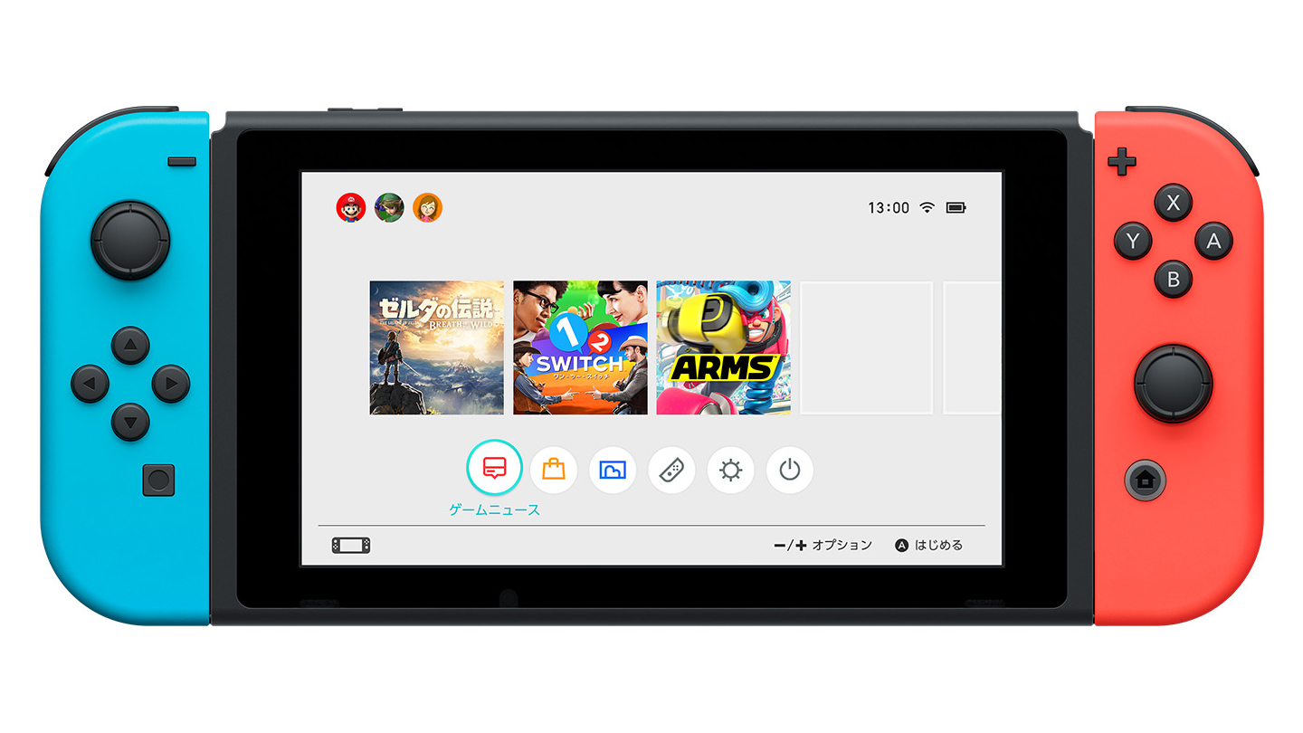
Given the form factor of the Nintendo Switch, I figured Nintendo would more than likely create a user interface similar to the one it has for the Wii U GamePad, only more refined. We didn’t get a good look at the Switch UI during the company’s presentation, but this after-the-fact image is insightful:

The buttons in the bottom row are for the eShop, an “Album,” controllers, system settings, and a sleep mode. I’m not one-hundred percent sure on the first one with the red icon, but the all-seeing, all-knowing folks at NeoGAF think it’s for “Game News.” I want to see more, but I like this so far.

Brief look at the Switch UI [NeoGAF]


Destructoid is supported by our audience. When you purchase through links on our site, we may earn a small affiliate commission. Learn more
related content
Read Article Despite UK government response, Stop Killing Games is pushing for debate over publisher accountability in live service games
cars in the crew
Read Article Gray Zone Warfare Patch 1 aims to bring ‘over 200’ improvements, including bugs tied to lost gear
Gray Zone Warfare key art
Read Article Fortnite is teasing a Fallout crossover
Fallout and Fortnite collaboration
Related Content
Read Article Despite UK government response, Stop Killing Games is pushing for debate over publisher accountability in live service games
cars in the crew
Read Article Gray Zone Warfare Patch 1 aims to bring ‘over 200’ improvements, including bugs tied to lost gear
Gray Zone Warfare key art
Read Article Fortnite is teasing a Fallout crossover
Fallout and Fortnite collaboration
Author
Jordan Devore
Jordan is a founding member of Destructoid and poster of seemingly random pictures. They are anything but random.