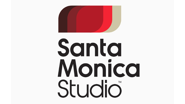
New Sony Santa Monica logo looks less like it belongs on an Ed Hardy shirt

This is a good thing

Recommended Videos

Sony Santa Monica, the studio behind God of War and helping hand on a bunch of other things, has a new logo. I like it. It also has more versatility than the previous Ed Hardy scrawl, as seen with the Hohokum color scheme. I appreciate a logo morphing itself to accommodate whatever it’s trying to brand.

Or maybe that’s more subtle and insidious.

Looks nice, though.


Destructoid is supported by our audience. When you purchase through links on our site, we may earn a small affiliate commission. Learn more
related content
Read Article Manor Lords dev promises future discounts for players missing Early Access
Manor Lords third-person perspective
Read Article Helldivers 2 player camaraderie has been shattered thanks to a cheeky Major Order
helldiver using stratagem in helldivers 2
Read Article Shadow of the Ninja Reborn shows more of its lovingly crafted revival, sets launch date
Shadow of the Ninja Reborn
Related Content
Read Article Manor Lords dev promises future discounts for players missing Early Access
Manor Lords third-person perspective
Read Article Helldivers 2 player camaraderie has been shattered thanks to a cheeky Major Order
helldiver using stratagem in helldivers 2
Read Article Shadow of the Ninja Reborn shows more of its lovingly crafted revival, sets launch date
Shadow of the Ninja Reborn