I’ve been following Borderlands for quite some time, ever since I saw it detailed in Game Informer back in 2007. The wait has been long, and that worries me slightly. However, if the latest rumors hold any truth, there may be a reason for the wait — changing an entire game’s art style will do that sort of thing.
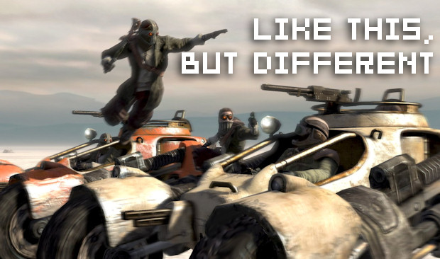
What we definitely know is the Gearbox has changed the game’s artistic direction since we last saw it. It originally had a very gritty, very dreary look to it. Late last year, a tester on the game had Twittered that the title was “still a year out from release. Not bad, but needs some work. Reminds me of Crackdown a little.” The tester was fired for his trespass.
It’s likely the Crackdown aspect may reference gameplay more than look, but it has since transpired that the aesthetics are different from when we last saw them. Gearbox community manager Ennui states: “We do care about all our fans, no doubt, and the decision to alter the art style was assuredly not one taken or made lightly … Though there’s always the chance some people could be turned off by the style, it was decided that, overall, it fits the game and creates a more visually interesting experience.”
[Update: Community member TnS has shared with us a quick scan from a bit of a magazine and it does indeed have elements of Cel-shading in the new aesthetic. Fellow commenter Scroll says it uses a hand-drawn technique that is then scanned into the game. Check out our comments for the scan, and hit the jump for more comments from Gearbox’s Ennui.]
“Our concept art had this incredible, distinctive style and feel that fit so perfectly – the game has not become less detailed or washed out at all,” continues Ennui. “Rather, it retains the detail and style that’s often lost when we move from concept art to 3D. It stands out, and makes the gray-and-brown bleak landscapes, while still bleak and inhospitable, memorable and recognizable. The entire world has life to it, from the creatures to the very rocks and dirty walls. The game world is no less gritty, dirty, or harsh — all of the detail is there, and the environments have even more atmosphere. We solicited feedback from our focus testing initiative, which consists entirely of a very large pool of gamers from all walks of life, and in the end, the choice was clear for us.
“Whether or not you are excited about the art style, the core gameplay is still the same: gritty, fun co-op FPS action on an alien frontier world with RPG elements and a metric shitton of guns. And it is a hell of a lot of fun — I may be biased, but I’m also a gamer myself, and I have had a chance to play the game. I think it would be fun if it looked like a PS1 game. I think a great deal of people will agree with this (and a great deal of our testers have already). The PC Gamer article has a great write-up of the player experience.”
The community manager adds: “I’ll definitely be sad to see anyone put off go, but I do hope that on release (and maybe even before as we release a bunch of new media), you’ll give it a shot – even if it’s just playing a friend’s copy or something like that. I think you may still be surprised.”
So, we know the game’s look has changed, and that it’ll be more vibrant, which definitely hints that something a little more “cartoony” could be on the way. I’ll always welcome a game that strives for a different look, but with the title slated for this year after already being pushed back from 2008, one wonders just how much time and effort has been expended, and whether that will affect the rest of the game’s quality.
Regardless, I am still hopeful for the game’s ambitious concept. We’ll sniff around Gearbox to try and find out more, and will let you know.


